Returns Portal
Project Overview
Make it quick, make it easy
To enhance the customer experience shoezone wanted a Returns Portal to streamline the returns process by providing a quicker and more efficient way for customers to get their money back. The project was only built for the website, as the company had not yet developed an app yet.
As the UX/UI Designer, I was responsible for the design and user experience throughout the project, which spanned seven months from research to launch. The team included the Head of digital, developers, testers, marketing, warehouse management, and customer service.


Problem Statement
Where's my return?
The primary challenge was to address the pain points experienced by Shoezone customers during the returns process. Customers frequently contacted customer service to inquire about the status of their returns. From a business perspective, Shoezone wanted to track return reasons more effectively to inform buying decisions and reduce the volume of customer service inquiries related to order statuses.
The target audience for this project included Shoezone customers, with a particular focus on younger users. The portal also needed to cater to older customers who generally have different shopping habits.
Research
Speaking to the front line
To understand user needs and preferences, we conducted competitive analysis, examining how other companies handled their returns processes and the timeframes for refunds. Additionally, we gathered data from Shoezone’s customer service team, who were dealing with customer issues.
Our key findings indicated that customers prioritised knowing when they would receive their refund, specifically when the money would hit their account. As it often took up to 15 days, the process involved multiple steps, including transit through Evri or Royal Mail’s network, scanning at the warehouse, inspection by our warehouse staff, and finally the payment provider processing the refund. The prolonged timeline led to customer dissatisfaction.
This insight guided our design, emphasising the importance of clear communication about the refund process and timeline. We also aimed to prevent system abuse by carefully timing refund disbursements.


Ideation
Don't reinvent the wheel
When I joined the company, the back-end systems were already mapped out by an in house developer, which heavily influenced how the returns portal would function. I began by creating rough sketches that reflected the various stages of the returns process, including item selection, issue reporting, return method selection, and the post-return journey. I based the user flow on these back-end systems.
Acknowledging the complexity of the project, I developed scenarios to simulate customer interactions within the portal and collaborated with developers and testers to ensure the flow was functional. My wireframes were inspired by successful elements of other returns portals, focusing on simplicity and ease of use. I structured the pages into blocks for better information digestion, using colour and buttons to guide user actions.
Design
Clean and functional
The visual design of the returns portal adhered to Shoezone’s existing website aesthetic, including predefined colour schemes and typography. My goal was to maintain a clean and straightforward design, minimising colour use while effectively breaking up content with headings.
Given the multi-step nature of the process, the design aimed to be as user-friendly as possible, ensuring that customers could easily navigate through each stage whilst also being mobile friendly as 80% of customers shop prefer this method of browsing.


Testing
Working with HiPPO's
Extensive usability testing was conducted internally, involving senior stakeholders who provided valuable feedback. Some stakeholders suggested incorporating free returns to stores to boost conversions, a late-stage addition that posed design challenges. Additionally, some users found the number of steps overwhelming, leading me to combine pages—though, in hindsight, I would have retained the extra step to avoid issues during the live rollout.
Some customers found the page where you select your return method and enter your personal information confusing. Something that was not picked up during iteration.
To avoid this in the future, I would not ask the same user testers to retest the issues they suggested as there may be some bias when they provide feedback.
Implementation
Building around hurdles
Collaboration with developers was crucial in bringing the design to life. After writing the specifications, I worked closely with developers, often sitting with them to address challenges and ensure the design aligned with back-end processes.
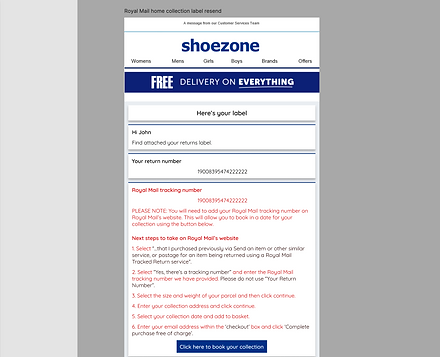
A significant challenge arose when Royal Mail could not pass home collection information from our system to their system, requiring users to re-enter information on Royal Mail’s website. This issue led to tweaks and redesigns to accommodate edge cases.

Results
Positive data and a learning curve
The returns portal was launched gradually, starting with a small user group. As expected, the introduction of the portal led to a 2% increase in returns which may seem bad for the business but we have also seen repeat purchases from customers as they are happy to use the platform to return items.
This project provided invaluable insights into handling complex scenarios, such as home returns, in-store returns and the logistics behind it. The experience taught me the importance of anticipating potential issues and the value of a well-structured, user-friendly design. If I were to tackle this project again, I would consider redesigning pages to better capture large amounts of data, drawing inspiration from industries like car comparison sites, where user engagement is maintained through a step-by-step approach.